A Forgetful Loop
Making your story look good
So in Forgetful Loop is a whooooole bunch of story, built with the Ink scripting language. We've got approximately 16,000 words in the game, so it's probably worth having a good way of displaying that, huh?
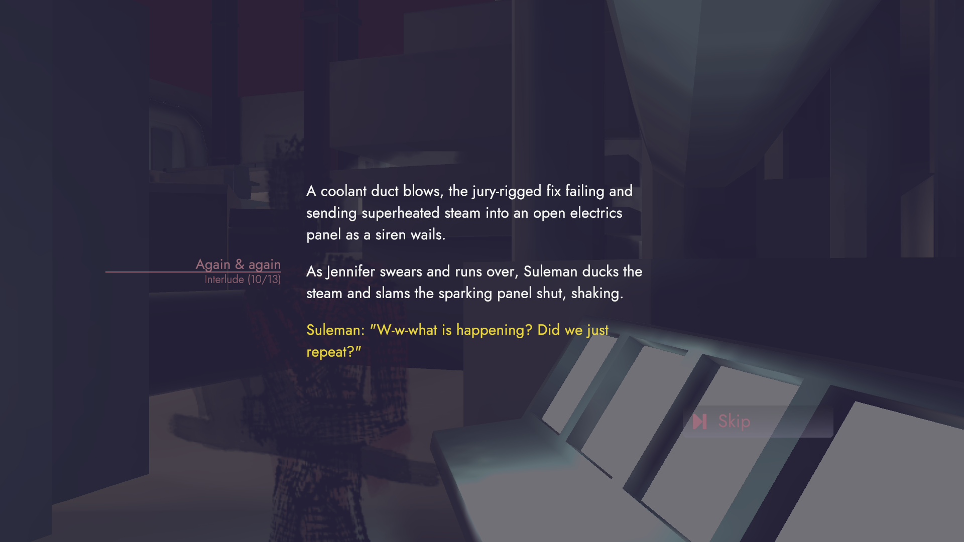
Now that I'm a couple weeks on/off removed from it, I think the way it's displayed is good, but falls flat a bit. We have a strong good half of what's needed:
- a dense, detailed-enough scene background, with a dynamic camera,
- minimal, clean visuals, a smooth text fade in; and it's readable
- snappy input to continue through the story
But it still feels... flat? how? Let's look elsewhere at a couple other games that I've played recently, which I think help to answer this:
Step 1: play games
a.k.a when you get so engrossed in your own game that you forget to look at others.
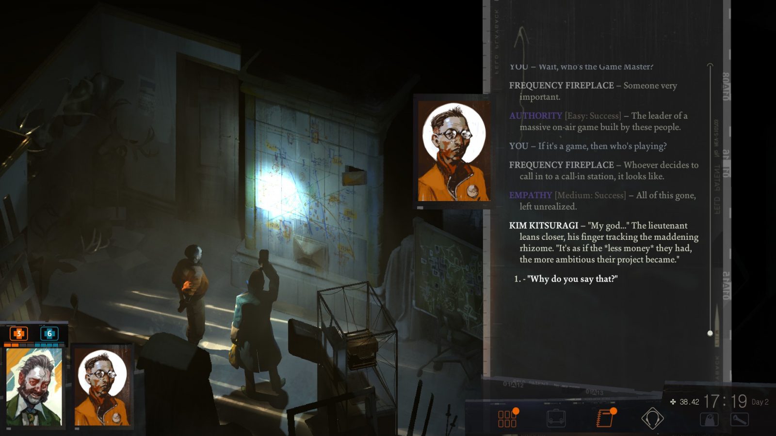
DISCO ELYSIUM
Disco Elysium is just engrossing to look at, and read through. To me, part of that is the "timeline" is so visually diagetic: a stream of photo tape, each choice chim-chim-schhhing it's way up. I feel like I just want to see more ticker-tape (and obviously more delicious wordy-words)
Now this also ties into a more general point of keeping everything flavourful of a similar variety - the game's UI plays off photographic tropes, this ticker-tape follows that. So another consideration is how your "Story View" ties into the rest of your UI landscape.

Therapy with Dr Albert Kreuger
The text itself animates, the scene is set very well. In Therapy with Dr Albert Kreuger there is a lot of action going on - the scene isn't static, but there's jolts/effects/stuff going on. The text isn't just flat but extremely animated (I think anyone who's followed "The legend of the laundromat" twitter feed can attest). But here you may notice another key thing missing - portraits, let's look at one more example:
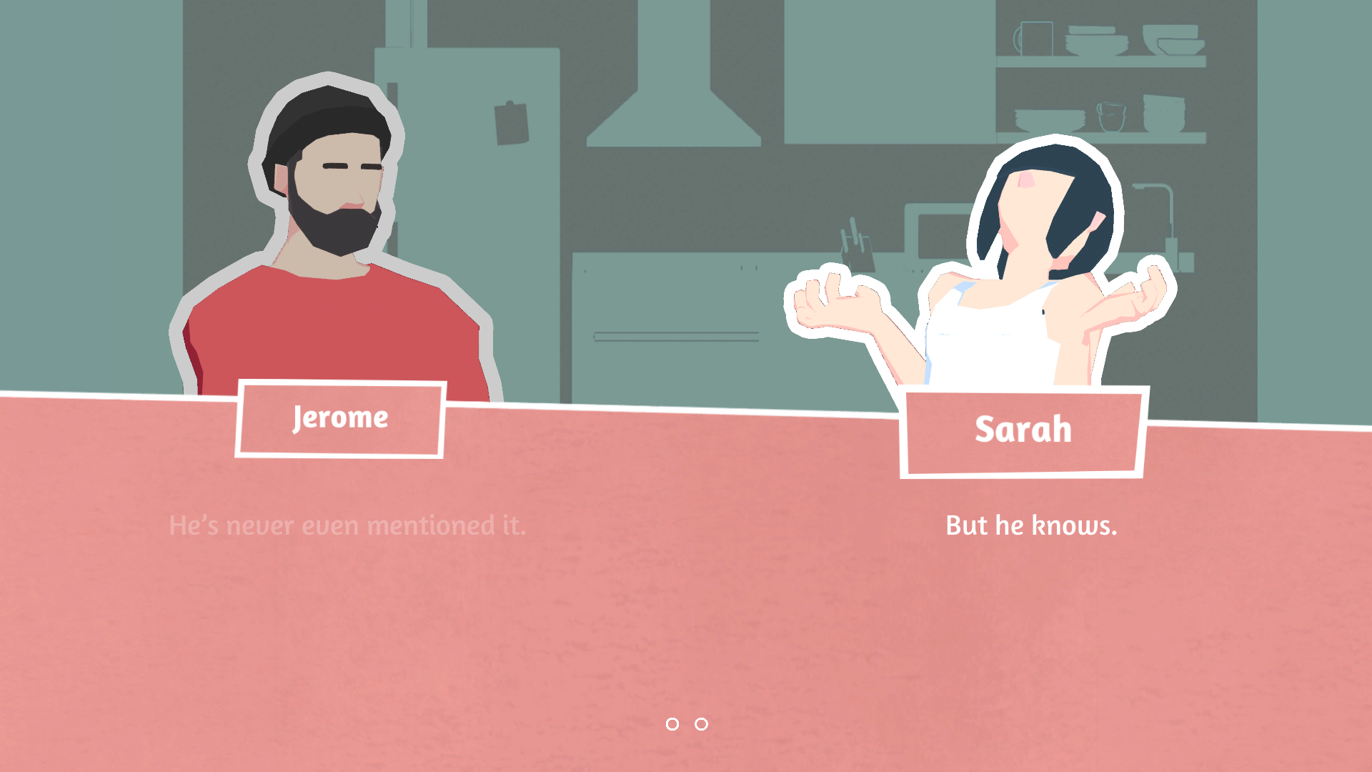
10mg: Locked In
Here is where the biggest thing in IF should be apparent - when you read a character's dialogue, you should see them too in some form. In Disco, you only get a stylistic portrait, but they're so painterly they just spew a visual idea at you.
In Therapy & Locked In, you see multiple expressions reflecting an emotion of the character. You get an immediate idea of what feeling the character is in. I think this is so much more important than just a visual, as it also helps to figure out what tone the character may be speaking in?
(also definitely check out Freya's new game, "Slasher, Interrupted", that also demonstrates a lot of what's missing in AFL)
But this is like all IF?
Now, this may seem extremely obvious, but I think it's still somewhat of a don't-know-it-till-you-miss-it kind of deal. For me, I thought that the environment is what mattered - hence why I provided camera angle tagging for Freya to get the "right" location for shots 'n such. This helped, but is only half the solution. We don't really get a grip on the characters themselves past their names - there's no visual representation.
Let's look at an example outside of IF that I've loved, The Solitaire Conspiracy by bithell games:

This is a pretty gorgeous example of having some great character art, a little snippet of text, and a unified gorgeous visual style all working well together; add a little imagination & you've got something fun going.
In a similar sense to Forgetful Loop, the story is somewhat set aside from the game - it's there to wrap around it and provide a neat through line of progression. What sets this a few leagues above is the quality of the assets - crisp lines, the cards have a sheen as they move, there's a lot of subtleties going on.
Of course there's also one HUGE difference - it's a card game, so having high quality face cards is a must. Forgetful Loop is more abstract, but given more time & budget, would aim for a similar level of crispness to the visuals.
So what does this change?
Following a study of all these examples, if I had to redesign the whole thing I think I'd blockout something like this:
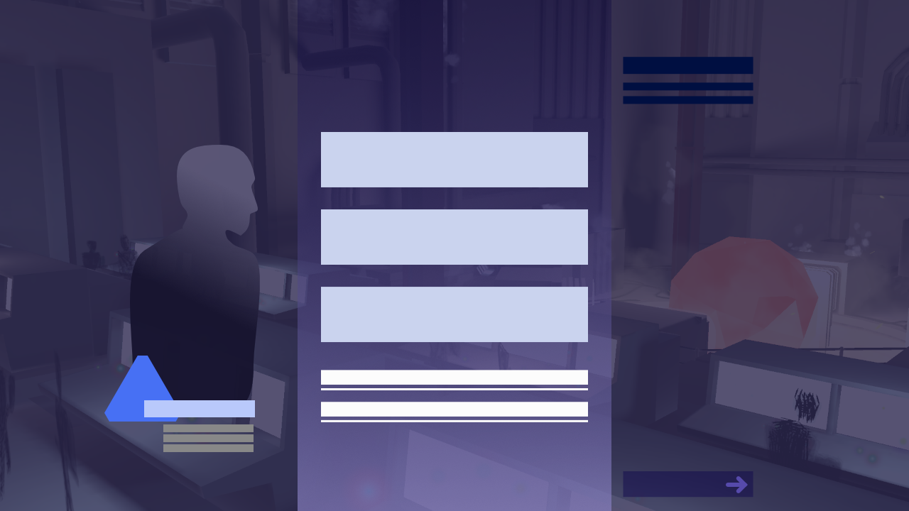
- Make the central pillar a little more interesting with a gradient (ideally, I would want to texture it & have some subtle scrolling animation when you step through)
- Old text is slightly less contrast than the next
- Add a portrait for the actively talking character, with their matching Triangle + fluff text
- Shift the current story title/subtitle across, and use that to visually balance out the skip button, which is now more subdued and pushed to the bottom.
- Reduce the opacity of the background tint, so you can see the scene more
Altogether, even as a mockup I think this is more visually pleasing & interesting (so I kind of wish I did this waaaaaay back, but then I was already neck-deep in code anyway, so it probably wouldn't have had a chance to be implemented 😑)
But another aspect is I didn't know an artist ready-to-go for doing the portraits, and likewise a delibarate choice of not showing what the characters look like to help reduce the artwork necessary. If I decided to add these portraits, it'd be 15 commissions worth of work (and cost).
(additionally many of the stories have more then 2 characters talking, so it'd need some way of showing a few shadows, not to mention the tag structure too)
So a key takeaway is that it's not hard per-se to make your story player interesting, but it's art heavy. You need an artist on-hand to be able to make your portraits sing.
Ok so just gimme a checklist
I think, if I was to revisit this, or update the game, or do another game, I'd have this checklist:
- Have your text display support rich tags, and custom tags to do custom effects with.
- At a minimum, you should try supporting italics, bold, caps,
- but also make your display supporting fading in, or a sharp SLAM of interruption.
- And make these triggerable via your IF code (in ink we used #tags to trigger stuff, but there's a lot more room to expand)
- An animated, scrolling, thematically rich background behind any writing
- A portrait of the character who's talking in the "active" line
-
+ if you can show differente emotional states
- ++ if you can show the other character(s) reacting during a line
-
+ if you can show differente emotional states
- Show the environment your characters are in/currently in
-
+ if you can easily move the camera/characters around it
- ++ if you can have the scene react (say by going to/from dramatic lighting)
-
+ if you can easily move the camera/characters around it
- Audio: ambient, music, and audio cues
Additionally, something I didn't do is implement some accessibility options (as I've got a whole other game to worry about, but it's worth keeping these in mind)
- Scalable text - the rest of my UI wasn't anywhere near ready for this, and also I needed a scroll view for my text area
- Colourblindness - in this case we had already made the decision to have "Character: Text" as the style format, which made this something I could "skip"
One last note is Performance: in my case, having played some other games, I think having something animating at 60fps (in my case, the unity scene,) helps to give a feeling of smoothness? Otherwise with a static view, to me it feels like a game is freezing/hitching. This depends on what you're making of course, but I'm a sucker for smooth framerates
And of course, do your research & reference. This seems obvious because it is. And because it's obvious you'll forget to do it (...like I did, but also because I had too much on my hands)
Here's a dev talk by inkle that I'm going to revisit for my next big project, which covers this topic pretty well from the visuals & UX aspects.
Leave a comment
Log in with itch.io to leave a comment.