Working on the game's Introduction
Hey folks, another <insert time period> later, and another devlog for Day of Maintenance. In this one I'm gonna talk about the tutorial/introduction for MDay following the first playtest build.

The Build
Getting together a build is always a trial of stress - especially the first major one you send out to friends. With this "first" (there was already the jam version, and feedback from folks as they started working with me on the project) there's 100s of things that can go wrong, or be misunderstood. So it's best to narrow down your focuses to a few things;
Going into it, I was expecting to hear loudest about the following:
- the game doesn't really explain anything about itself; which would in turn get an idea for how approachable the game is as standard
- the gameplay itself isn't immediately clear - switch to using the crane, then control the crane - but the goals should be: go to a site, look for markers, fix the markers, repeat
- additionally, the Minigames would be completely abstract & confusing, as they don't have any explanation apart from some images & controls UI
- we have a fair amount of story that pops up randomly, and some people will like it, some won't. But the ability is there to skip/ignore it if they want to
Now because I had some time (it pays off to leave dead air before your build), I worked to counteract these issues, taking some initial steps to make the introduction a bit gentler:
-
Before, the player would start in some random patch of desert not 10 seconds from a repair site.
I changed this to a more classical "you start in a valley, with only one easy way out past the clearly obvious thing to move to"
Then bump up the distance to something like ~30 secs of driving to get to it.
That way, players would be able to fiddle with the truck, then have to think about the crane mechanic.
-
The first site has more geometry around it to help mark it as an object to fix, and again, to try and funnel the player towards the site
-
Finally, adding a couple story triggers for the following cases:
if you drive past the site, play a story covering "hey you need to drive back and fix that site"
when you get close to the site, play a story going over the various terminals in the cabin, to help direct the player to look around (with a broken/out-of-date terminal to help reward the player for looking around)
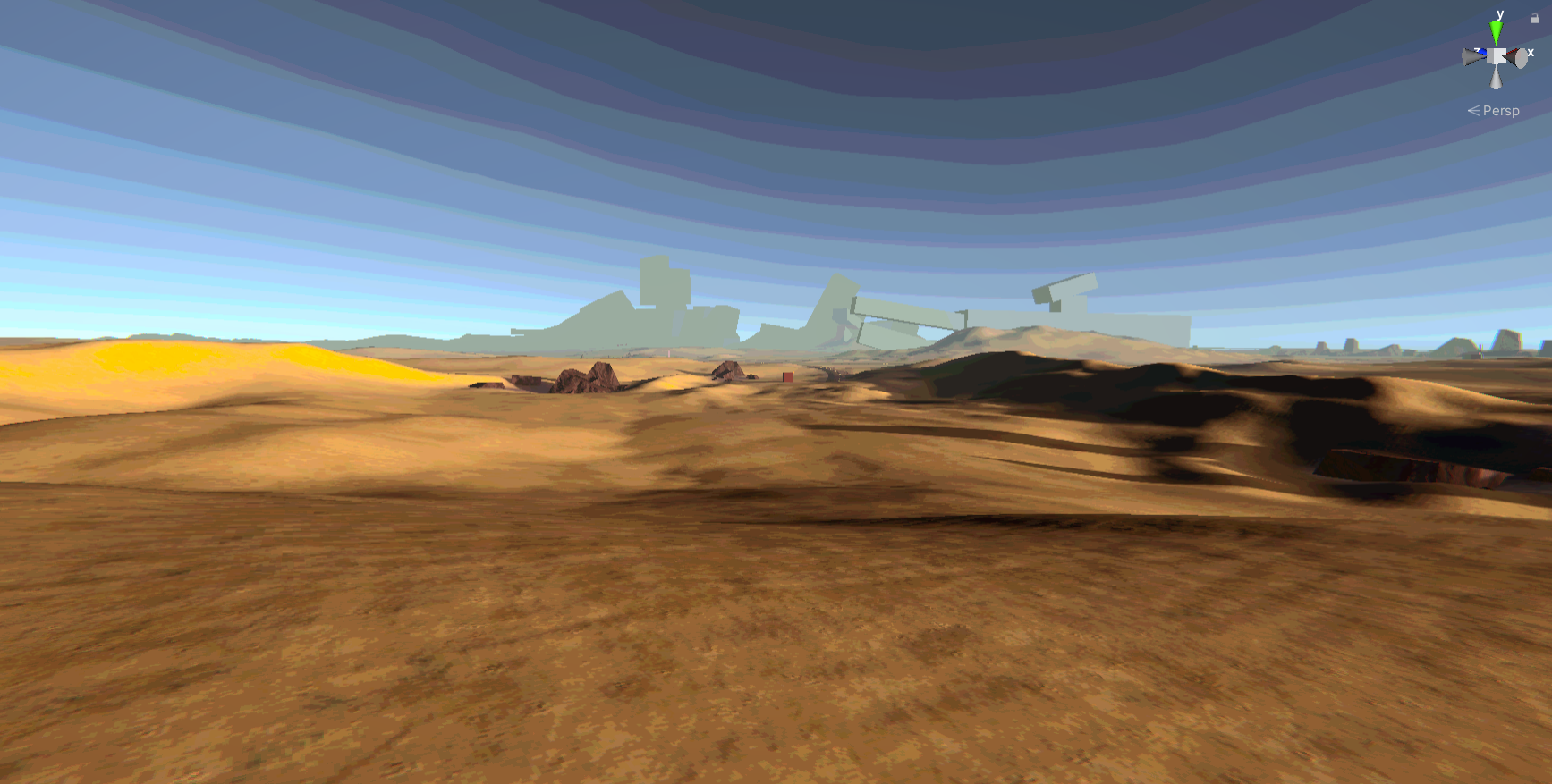
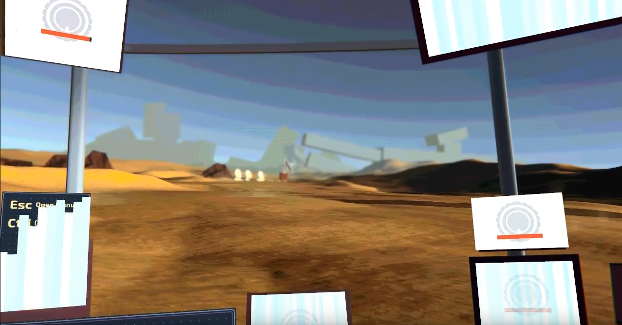
I thought those would help, but of course knew it wouldn't be enough as there was plenty detail left unspoken. Here's a snapshot of how the intro area changed:

View from the starting point after some terrain changes, before adding props around the site.

And after some changes, from the view of the truck as you approach, terminals all flickering into life.

The Feedback
What came out of the test was kind of what I expected... AND MORE!
- a couple people found the game completely overwhelming & without much direction, so they just drove around a bit then quit
- one player liked the driving/fixing, but didn't feel the story segments at all - running into various little behaviours that made the story prompts/text skipping dragging
- the cabin HUD in general was a lot to take in, with a few peeps purely decorative panels being mis-understood as critically important (when they're just there as fun animating objects)
- pretty much everyone didn't quite know what they were doing (as a player & as a character), a couple got that they needed to fix sites, but one didn't necessarily get the reason why
- along with the expected slew of "oh yeah. duh" problems to solve
This is one of those backhanded-compliment moments when doing your first tests: it's good that people are having so much trouble with the game, as that means I'm finding issues with the tutorial now. Not when it's 5 minutes after release, with a wave of "I don't know what to do am I dumb? :C" sad comments which break your heart.
~
Processing the feedback
Following the feedback (after getting over that emotional bump of "damn this game could use some work huh?"); the next hard moment is diagnosing & properly noting the issues they're facing.
It's something that I think I'll always be working on, as there's all sorts of ways of writing feedback, but here's a play-by-play of how I'm approaching it:
-
A tester is finding that the Intro is overwhelming
-
I ask them if they have ~5 mins to chat on discord about it
-
Then, try to ask open-ish questions around the problem - like "What part of the HUD was too much?" or "Why did you find it too much?" or "When the story UI appeared, did that make it too busy?"
(Finding it hard to explain this point, but) in my experience so far, I've found it best to try and figure out what the tester feels is wrong - they may suggest ideas or a fix entirely, but you as the developer need to keep in mind they're bringing their own understanding from the games they play, not the game you are trying to make.
The end result is you want to know the following:
- What thing is the problem? (remember it's the player's POV, so this can be a game object, or UI, or animation, or effect, or or or...)
- When is this problem happening?
- What is the resulting feeling of the tester? (so like if an input bug is making them angry, that's a much more important problem to solve then making them bored, right?)
-
Finally, when writing up the issue into whatever your task-tracker is, I do the following:
- Write the exact problem
- Then comment on it/bullet point under it with your ideas on how to solve it
The end result should be a big ol' document of problems & ideas, from which you can then make a new set of tasks to do once you (as a solo dev/team) agree on to implement.
To note: there's 10s of ways to solve any problem; but with a Tutorial, I believe you want the most easy-to-understand solution for the player - this may not be the easiest to code though, so be prepared to throw some hours into it.

& the Tutorial
Ok so this introduction IS OBVIOUSLY A COMPLETE FAILURE. Now how to improve it?
As of typing, I'm taking the approach of "use what's already in the game to instruct the player, and turn off what isn't needed", which is translating to:
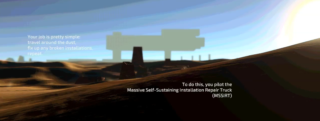
- Use the story player to display a short introduction story telling the player in more direct terms what they're doing (which also helps to teach the story player UI in a no-stakes moment: you aren't driving at the same time)
- On the drive up to the site, disable all non-essential HUD elements & behaviours, just show the immediate ones: how to drive, how to look, how to navigate to the first site (we can just pretend the other terminals are taking time to boot up, damn software loading times)
- When you get to the site, make the Crane HUD much more blatantly animated - have it do an alert ping, have it flash red, make it completely un-ignorable.
- The idea of using a story to teach the terminals might still work, but is far too much at once when the player is just getting to the first site; let's dial it back a bit to the bare essentials.
- Finally, disable other extras like being able to exit the Truck at first - switching to the Crane mode introduces a lot of complexity.
Further down the line, we still need to tackle some further problems:
- What happens if the player just drives past the first site? Personally I don't want to restrict them - if they drive on they drive on - but the game needs that first site fixed first to help setup the rest of the game. A conundrum for sure 🤔
- How to make the fixable markers look more... like a task to do? For people who don't immediately recognise it as a todo marker, but instead as just some animation/particle effect.
- (...also you can totally just flip the truck in the opening area super easily, because the truck physics are deliberately tricky, so you respawn away from the site, and aaaaaaaaaaaaaaaaaaa-)
~
Getting into the Tutorial headspace
Before wrapping up, I wanted to write some ideas on how to get into the zone for doing tutorial stuff - by no means have I "cracked the code" of doing so, but they've helped a bit:
No matter what, you will always be too close to your game: one slip-up we had as noted above was that introduction doesn't tell you what you're doing or who you are. Now me being the dev on the project, I was like "wait that's not right, we say you're fixing stuff, right?"

ahh, right, yeah that's a little unclear. Some text that means something to you won't get across all the information to the players - you know all the context for the game, they know nothing. Much like a good first paragraph for a short story, you want to get across:
- who is player,
- what is their goal,
- how do they do that goal?
To get there, it's almost like trying to explain a shitpost to a friend who isn't online: you need to somehow summarise what the shitpost is, what the joke it's riffing on is, and what the context is, all without ruining the joke (which never happens, you almost always ruin it by explaining it)
Play other games' tutorials, both big & small:
- replay an old game you loved & haven't played in a while - how does it teach the various systems? Do you find the tutorial grating? If so then try to run through your feedback steps: what's pissing you off, when did it trigger, why are you feeling it.
- play a game you haven't played before, and try to analyse it's tutorial as a fresh player: how would you do similar steps in your game? (and also try to not over-analyse it; as otherwise you've now just ruined a fresh game experience for yourself which suuuuuuuuuuucks)
- likewise, try playing games without tutorials. Gamejam games are good for this, as it's incredibly difficult to find the time for a good tutorial, so you get all sorts of solutions & hacky explanations for gameplay concepts

Wrapping up
To finish up - the tutorial isn't done, not by a long stretch (I'm expecting more issues to pop-up when the next build goes out). But hopefully this helps other devs when tackling their own introductions.
It's the first 5 minutes that count! (& the 5 longest to refine...)
Get A Day of Maintenance (Jam Version)
A Day of Maintenance (Jam Version)
A driving fix 'em up crane-operator game for 7DFPS
| Status | Released |
| Author | BigHandInSky |
| Genre | Puzzle |
| Tags | 3D, Atmospheric, crane, desert, Driving, fixing, maintenance, Open World, Sci-fi, Singleplayer |
| Languages | English |
| Accessibility | Color-blind friendly, Subtitles, High-contrast, Interactive tutorial |
More posts
- Site Update Teaser - The Sunken DishJun 07, 2021
- Validating Unity Builds the easier wayMay 15, 2021
- Character TeaserMar 30, 2021
- Improving the Vehicle CameraMar 20, 2021
- Adding world propsFeb 21, 2021
- A helpful Ink-Knot PropertyDrawerFeb 07, 2021
- Things you should know before making a Vehicle in UnityJan 30, 2021
- Useful scripts for Quick 'n good UGUIJan 13, 2021
- A sneak peek at what's comingJan 01, 2021

Leave a comment
Log in with itch.io to leave a comment.